Untranslatable (This refers Japan's domestic circumstantial problem)
日本語題名《ミスターブックOフときどきゲOマスター》
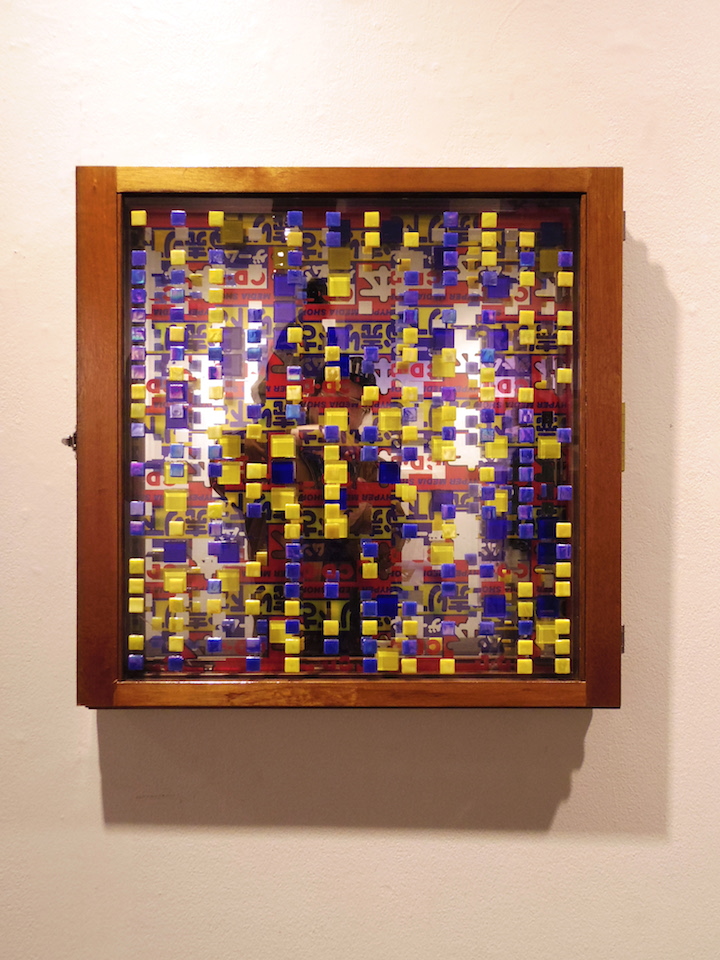
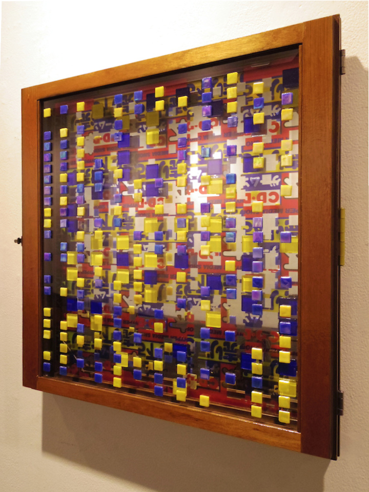
media/size: glass, glass tile, glue, wood, metal, inkjet print on mirror/ 60 x 60 x 6 cm
An exceptive work from my conceptual definitions, the exact title is :
Untranslatable;
acdcalecempirealiceinchainsanthraxartensembleofchicagoasherd&daddyfreddyaswadatariteenageriotaudioslaveautechrebakufuslumpbasspatrolthebetabandbeastieboysbimshermanblooddusterboot-
sycollinsbustarhymescannibalcorpsecarlcraigcorrosionofconformitycryptopsycypresshilldrideathdelasouldigitalundergrounddinosaurjrdj6666feattheillegalsdjspookythatsubliminalkiddmxdrdreecdento-
mbedfaithnomorefantômasfatboysgeorgeclintongoldiehardfloorhellchildhelmethiromigohouseofpainjb3icetimpalednazarenejeffmillsjuliancopejunglebrotherskenishiikurtismantronikkomekomeclublai-
bachlaurinhillmanforevermantronixmasterpmegadethmelvinsmethodofdestructionthemightymightybosstonesministrymisfitsnaughtybynaturenineinchnailsozzyosbourneobituarypanterapigprimalscre-
amprimusprinceandtherevolutionprincebusterpublicenemypublicimageltd.raelredhotchilipeppersradioheadrdprejierisefromthedeadrollinsbandtherootssepulturaskidrowslayertheslitsslytherevolutionar-
ieswithjahthomassmapsodsodomsonicyouthsoundgardentakkyuishinotelevisiontooltsoltwigytwilightcircusdubsoundsystemtypeonegativeulverskullthrashzonevolumeithepachinkomusicfromsankyowa-
gaseishunnomeishatachitype1warxclanutadahikaruoginomeyokokoizumikyokohamasakiayumi
This work refers to Japan's domestic circumstantial problem.
This features, as its motifs, icons of Japanese stupid big secondhand stores that make us smell poorer. The above title consists of artists' names from CDs I bought at the bad stores.
I dropped this as an ironic bomb onto a group (competitive; I was nominated by a curator) exhibition in a conservative museum called Ueno Royal Museum which has only domestic aesthetics, to criticize the narrow view, means that physical poor attacks cultural poor.
The exhibition title is VOCA 2016 which has been based on Japan's conservative art aesthetics.
As stated above, this is an exceptive work from my conceptual definitions. However, this work is the first work that strongly refers to my daily life’s problem that can be treated as similar to Japan’s circumstantial problems. This is why I used a mirror as its material. That is, when the viewers are in front of the work, they are forced to be a part of the poor icons that are printed on the mirror, to let them realize that they have a common problem.
The composition of the 2 large types of blue and yellow tiles symbolizes the 2 stores' logos. The stores are “BOOK OFF” and “GEO” that have the 2 colors on their logos (see reference photos).
The numbers of the tiles were determined by a computer programming I coded myself, using ratio of the each store's numbers in Japan “37:63”. The bigger tiles mean BOOK OFF’s 37, and the smaller tiles mean GEO’s 63.
Concretely:
///
BOOK OFF
direct managed 419
franchised 523
Total 942
—
GEO
direct managed 1,370
agent 92
franchised 128
TOTAL 1,590
BOOK OFF:GEO = 37:63
BOOK OFF + GEO : BOOK OFF = 100 : x
2532(942+1590) : 942=100 : x
x = 94200 / 2532 = 37.2
BOOK OFF + GEO : GEO = 100 : y
y = 100 - 37.2 = 62.8
///
I set the ratio of blue and yellow to 1:1 each.
This work was exhibited as a pair in VOCA 2016, with the other work Terrible Events which was also an ironic bomb onto the exhibition.
The pair has a conceptual contrast; this expresses decorative but cheap mentality, and the other expresses a non-decorative sophisticated idea.
The presented text into the museum was this.
To be honest, this exhibition has made me sick and brought on me a kind of deep trauma.